Fashion Collaborations

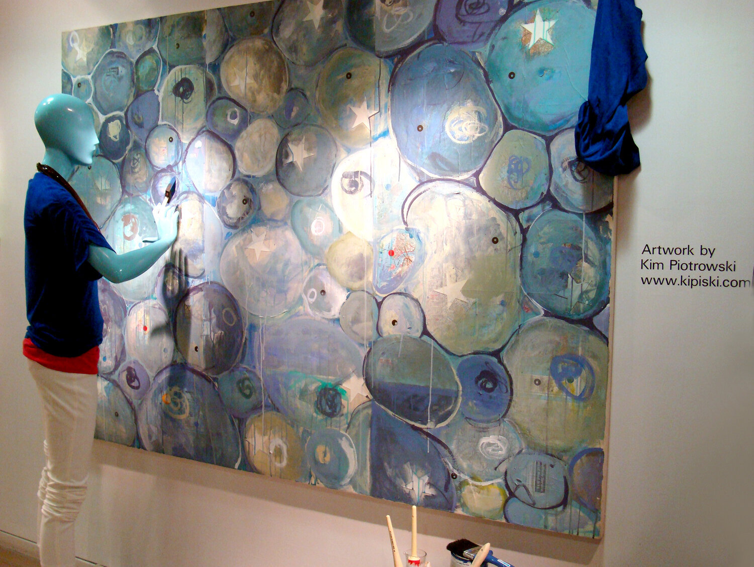
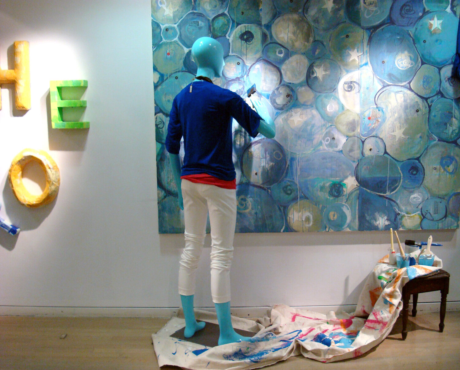
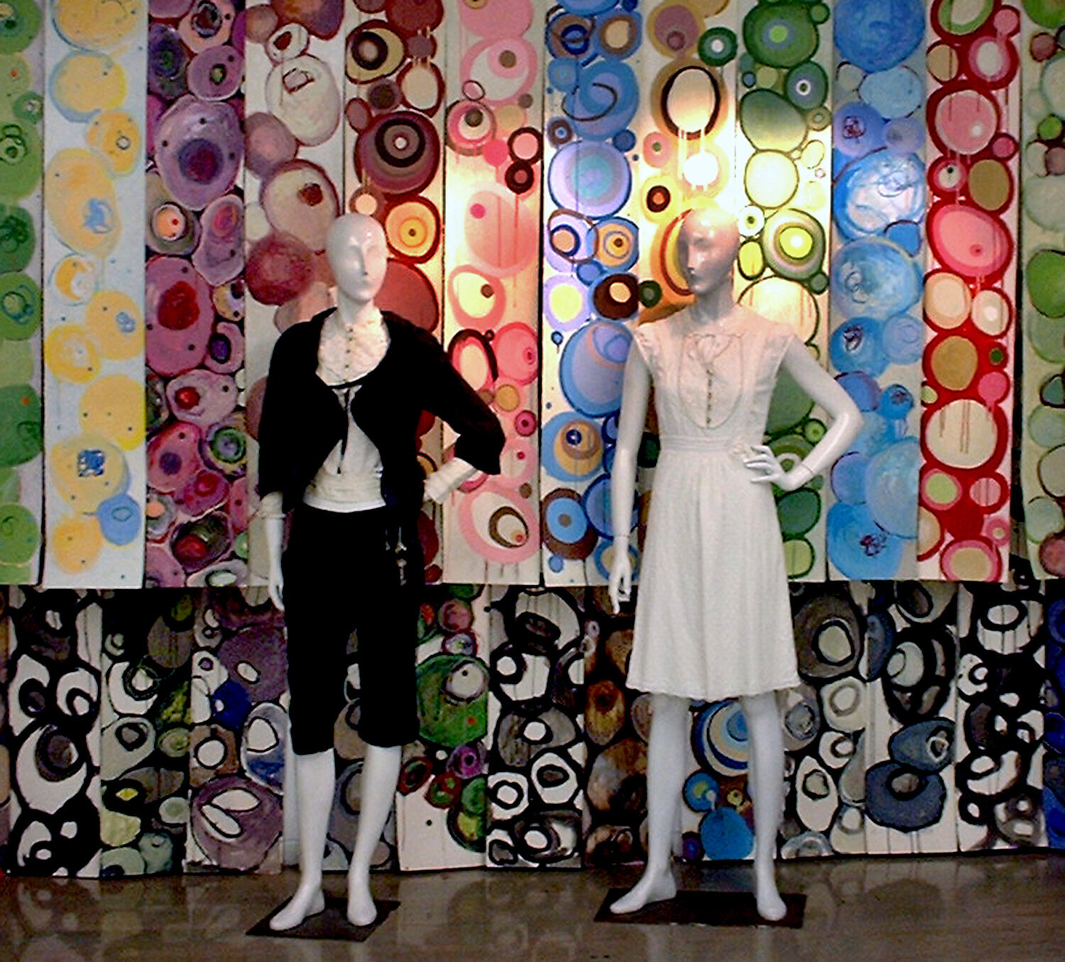
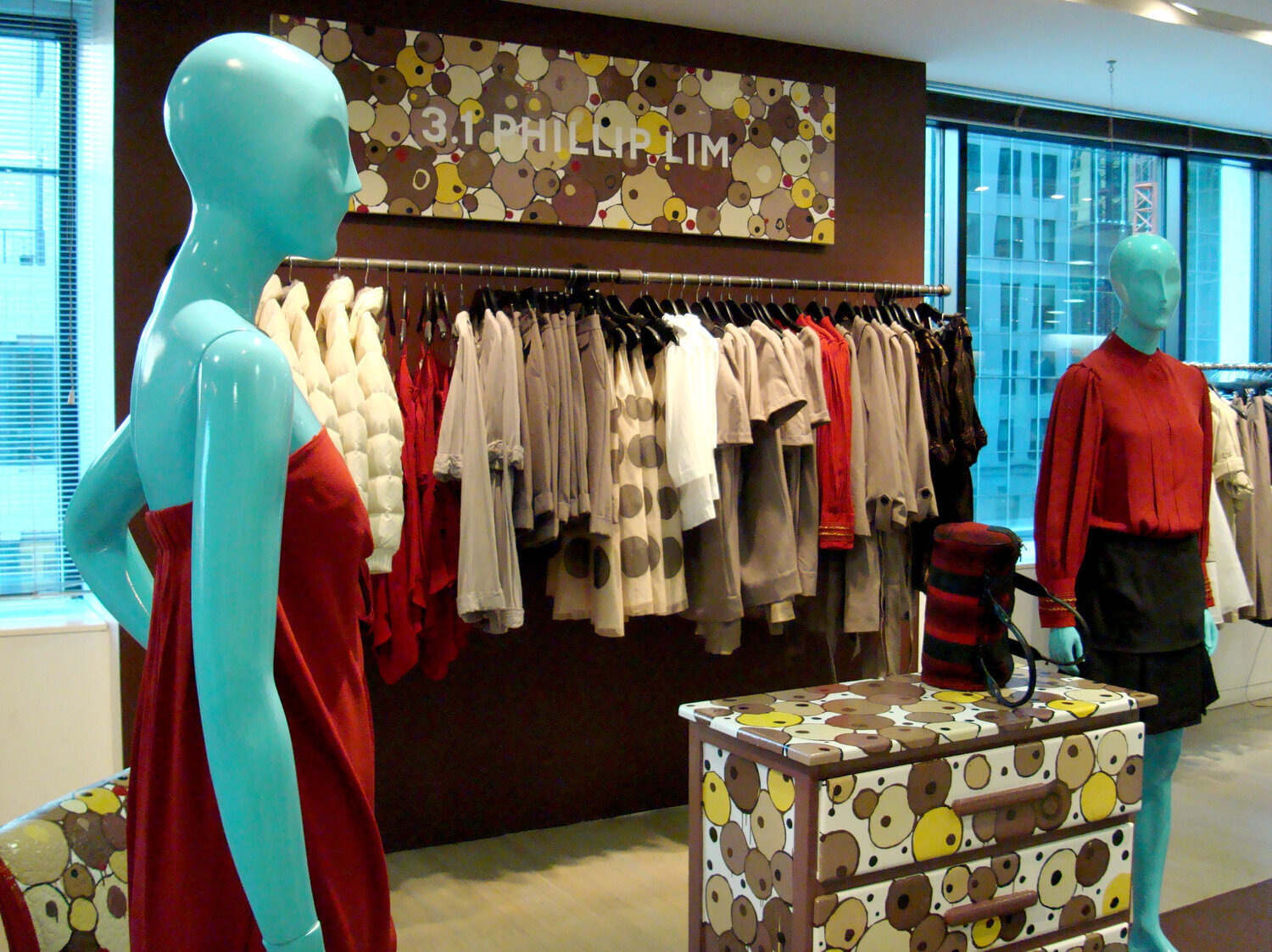
Barneys (2006-2011)
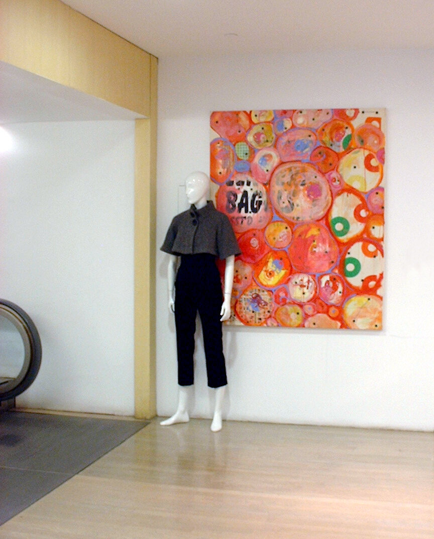
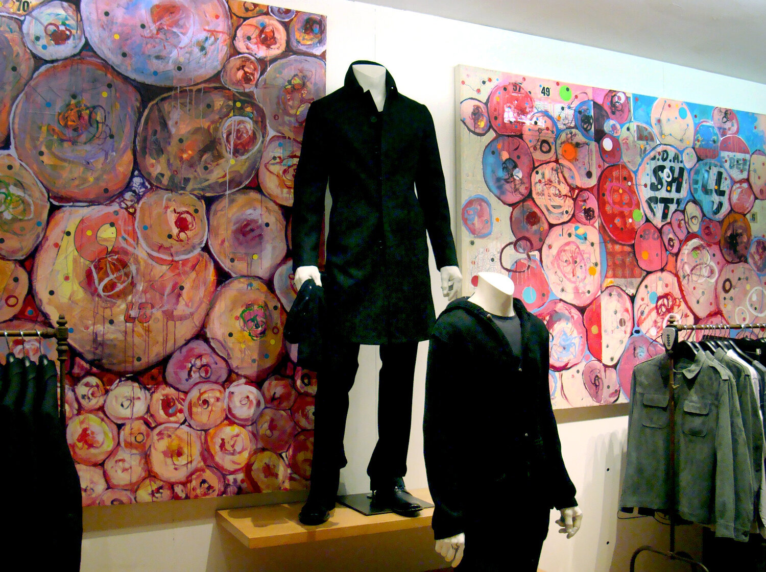
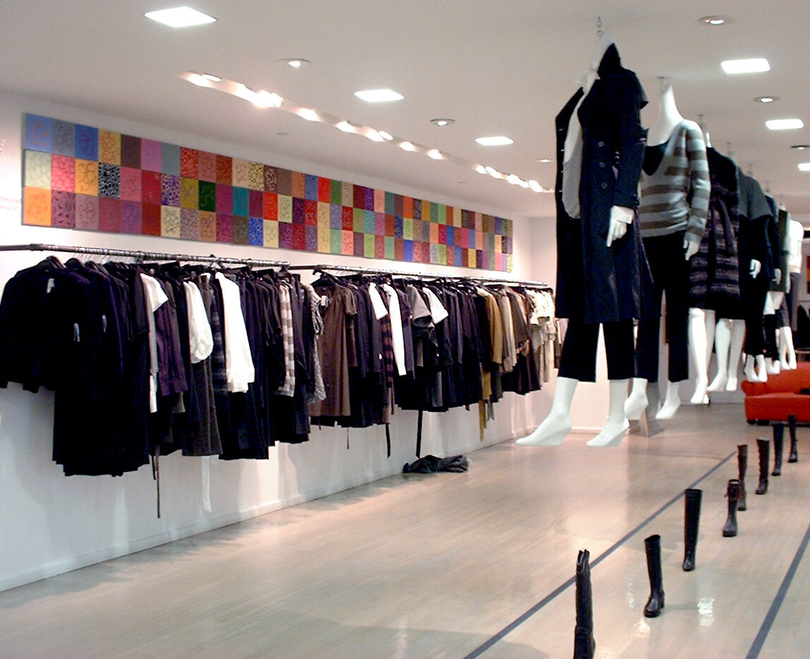
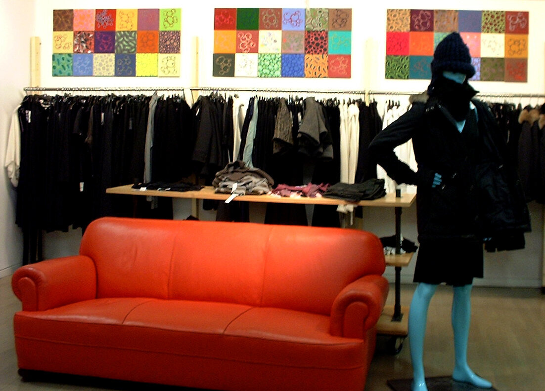
Fashion retail powerhouse, Barneys New York in midtown Manhattan collaborated with me using over 200 of my paintings for display in coordination with New York’s Fashion Week beginning September 2006. The paintings were on view throughout the store and were paired with the garments of notable fashion designers.
I have always been interested in fashion, and often look very closely at window displays, fabrics, and ever-changing trends for inspiration. My work is largely drawn from my previous microbiological studies and the billowy lettering of New York graffiti murals, emphasizing unusual color combinations and pattern. Drawing from my diverse interests from seemingly different worlds, my deconstructed cells morph into an unusual landscape through a repetitive accumulation of dots, circular movements, bubble-like forms, and drips.
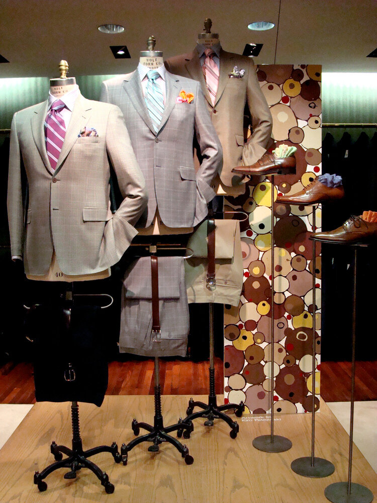
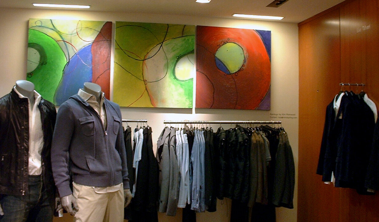
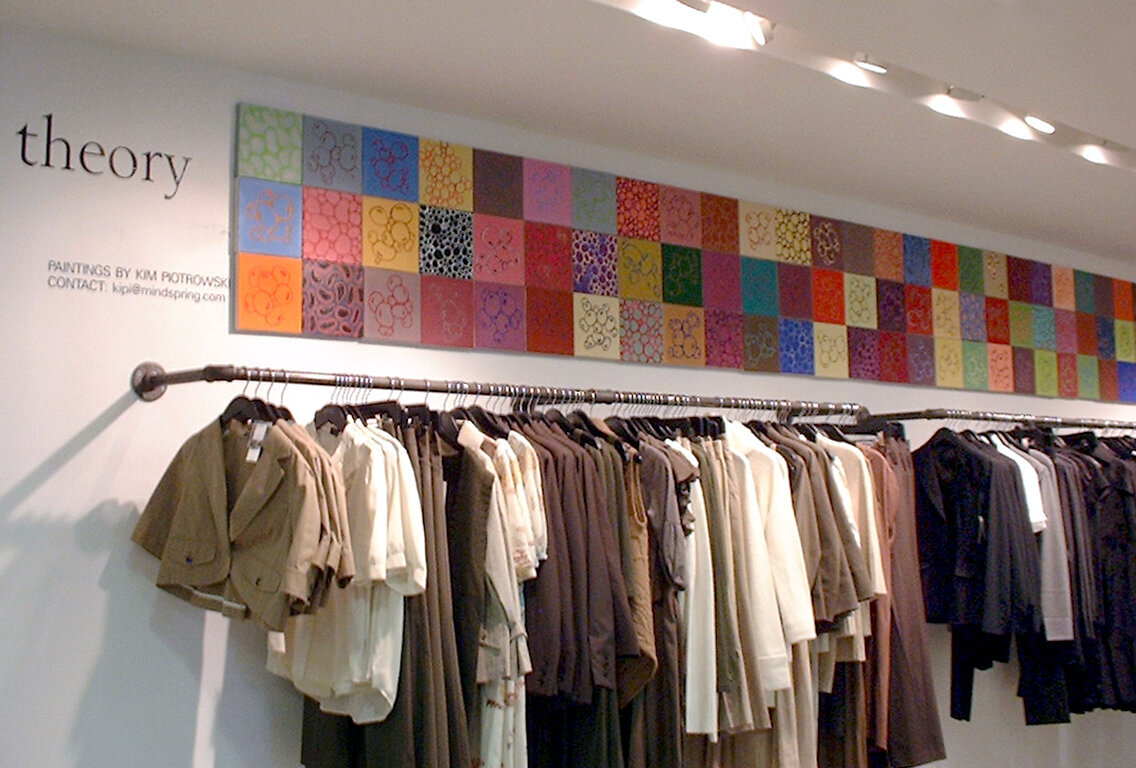
The installation at Barneys includes a large colorful grid of almost 200 small paintings that line an entire wall. The ongoing series was created based on a particular faux marble fresco that I discovered in the corner of an ancient church while studying in Venice, Italy. My paintings explore color and simple forms as they complement the designer apparel. Both are displayed together in the quirky style for which Barneys is famous. The result is a stylish merging of art, fashion, and commerce.
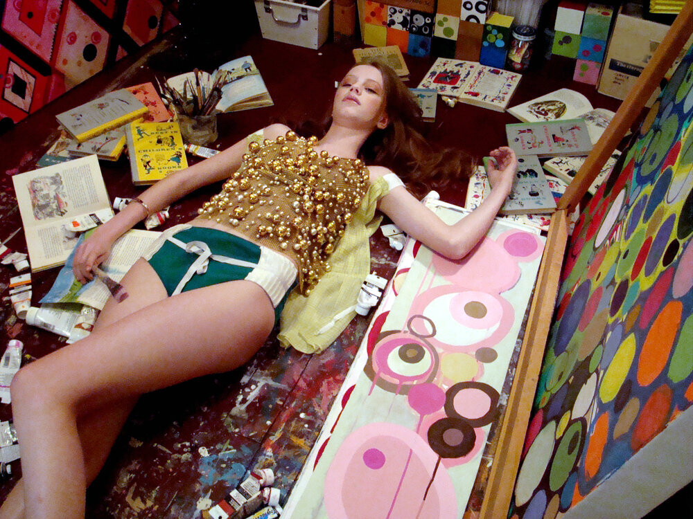
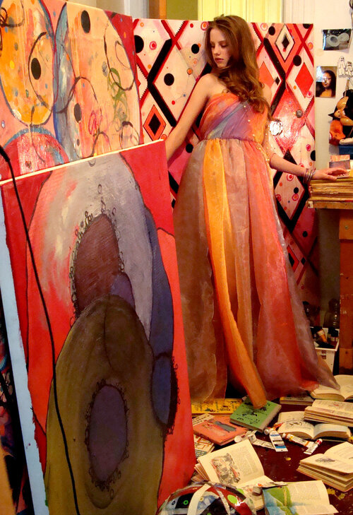
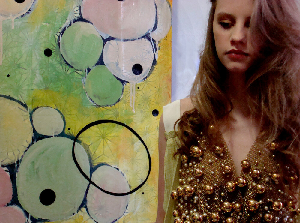
PLAZTIKMAG – ART STUDIO PHOTOSHOOT (2010)
I met Mimi, stylist and media guru, a few years ago when we were both standing in line to crash a fashion show at Bryant Park. We became friends immediately, and in no time, Mimi was sending me to different runways during New York’s Fashion Week for photo assignment contributions for her blog, PlaztikMag*.
A few years later, on a cold day in January, I hosted a fashion photo shoot for PlaztikMag in my art studio. The resulting video and photos for the project would feature different sorts of young New York women called, “Downtown Girl”. A little bit of her exists in all of us- she's the creative, free-spirit; the demure and reserved bookworm; the music-lover who loves to play it loud; but be careful- she can also be dangerous.
You know her; she rises at noon, she stays up very late, she calls the deepest, darkest innards of the city her playground, and through it all, she's forever the stylish fille. The first “girl” profiled in the series was The Artist, an urban archetype who was styled and photographed in my Brooklyn art studio. As you can see, before doing any painting, The Artist sits back and thinks very deep thoughts! On the day of the shoot, Team PlaztikMag arrived with a mammoth suitcase of clothes and a giant duffle bag of lighting equipment.
Then, the model, April, and her mom arrived in a taxi. After a quick coffee run, the hair and makeup artist arrived too. The kitchen and bathroom became the styling and wardrobe area, and my art studio was the staging area for two of the “looks” (out of four). My little Brooklyn apartment was a beehive of activity! PlaztikMag’s aesthetic highlights the grit that evokes the feeling of the early 80's New York that has been missing in the New York that I came to know during my twenty years living there.
* No Longer Online
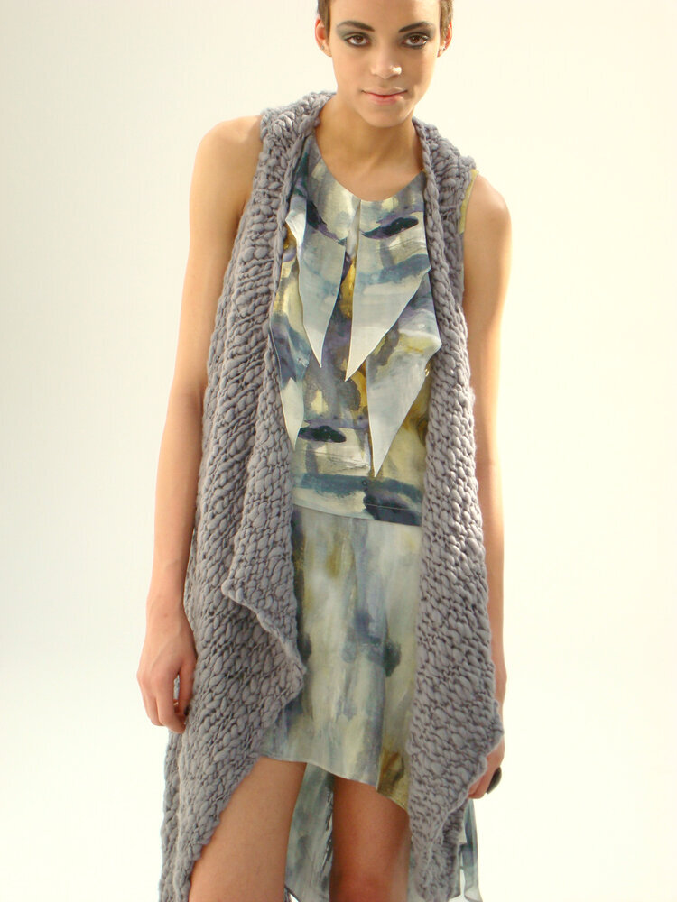
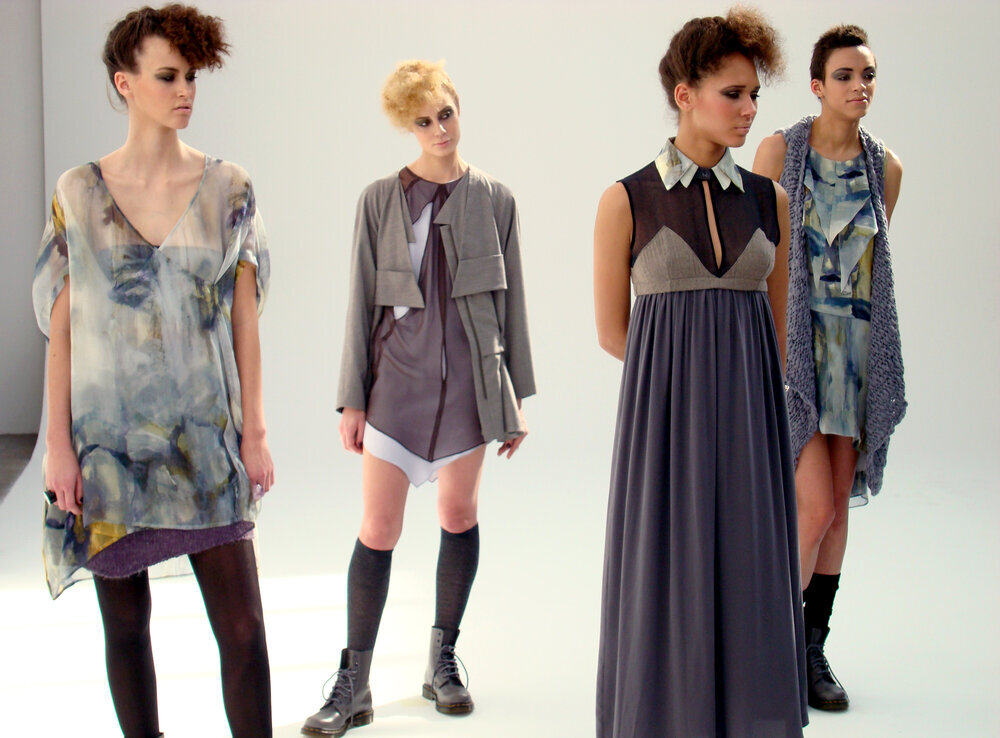
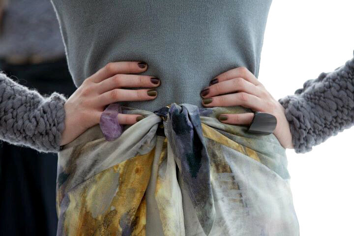
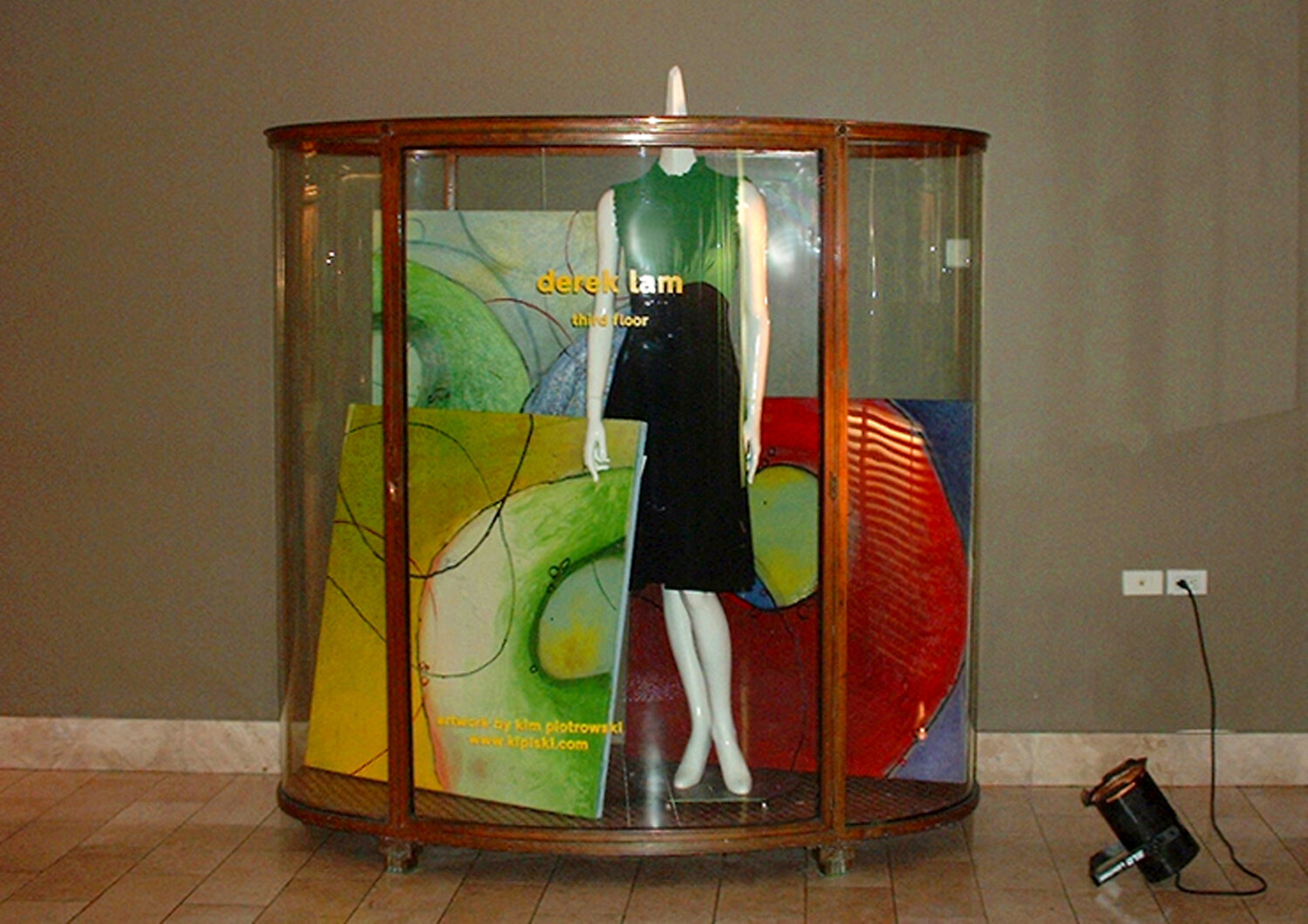
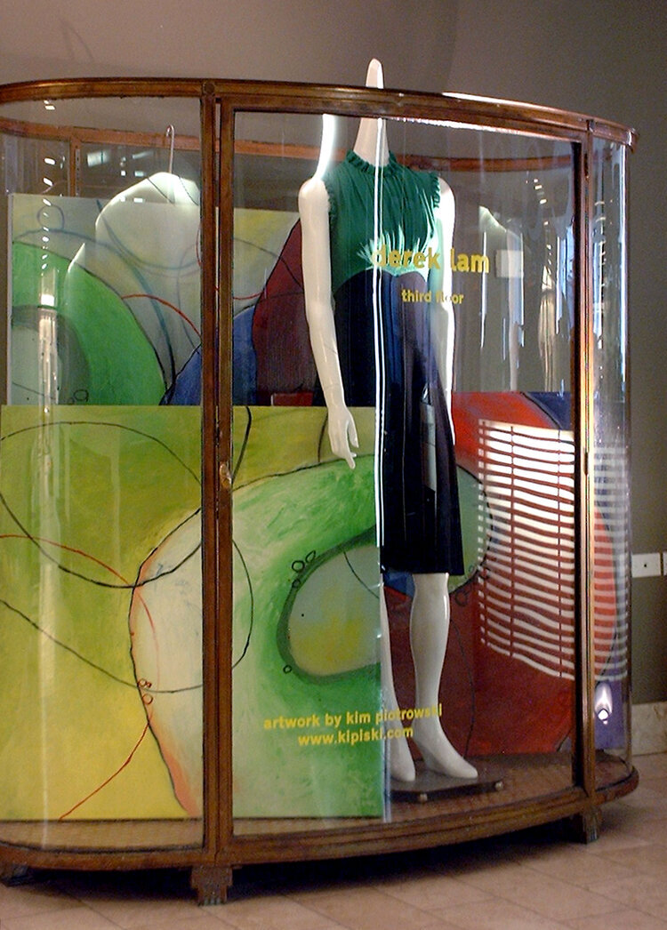
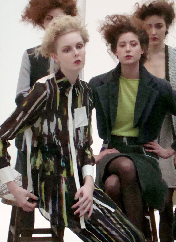
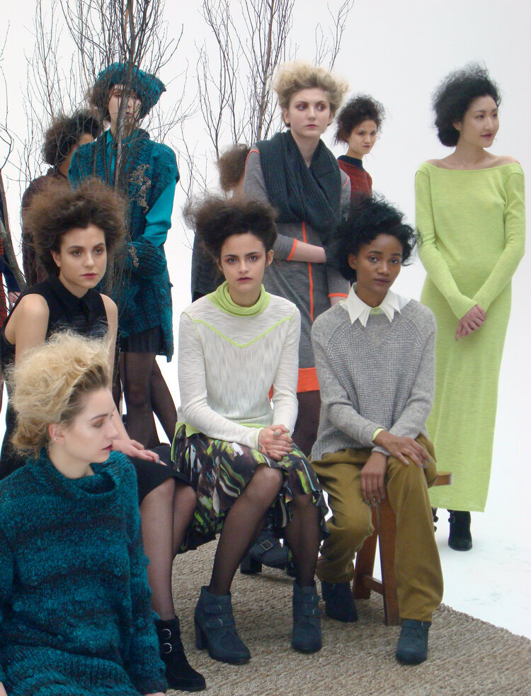
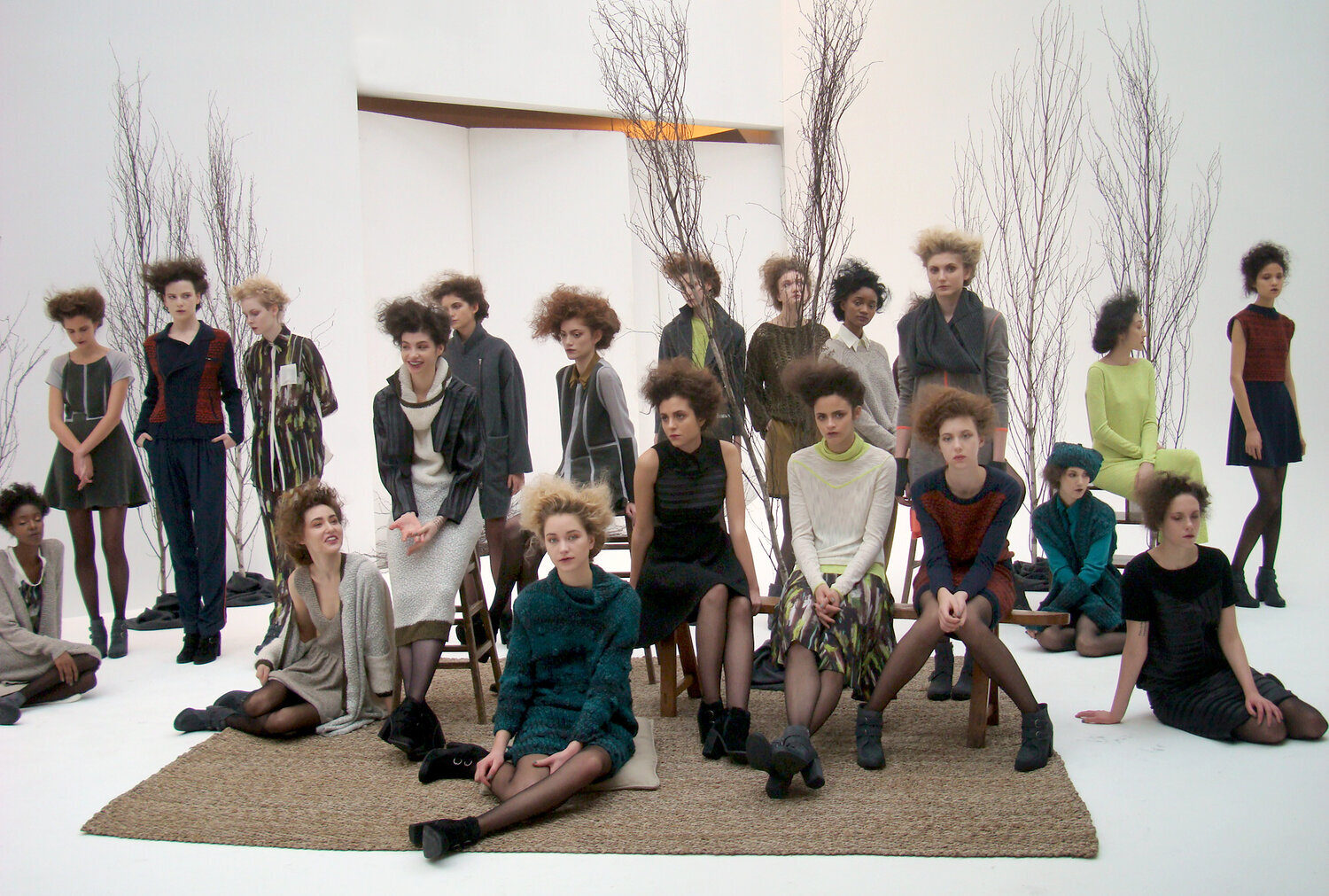
ANN YEE (AUTUMN/WINTER 2012)
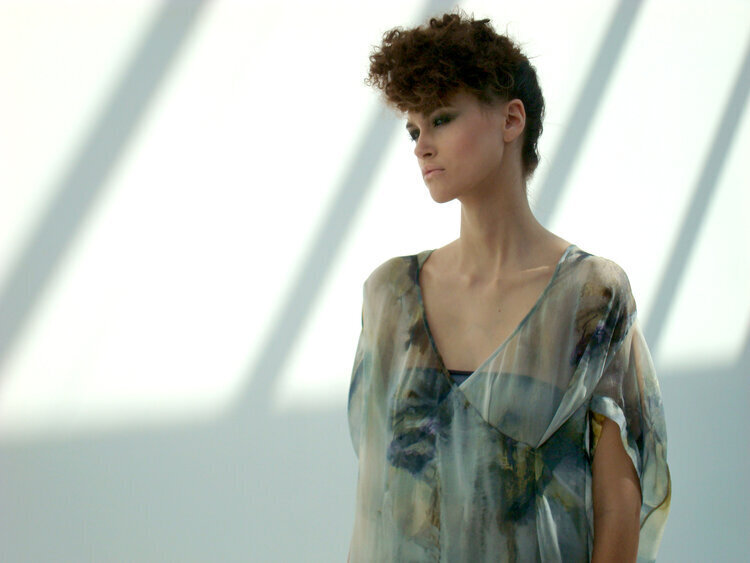
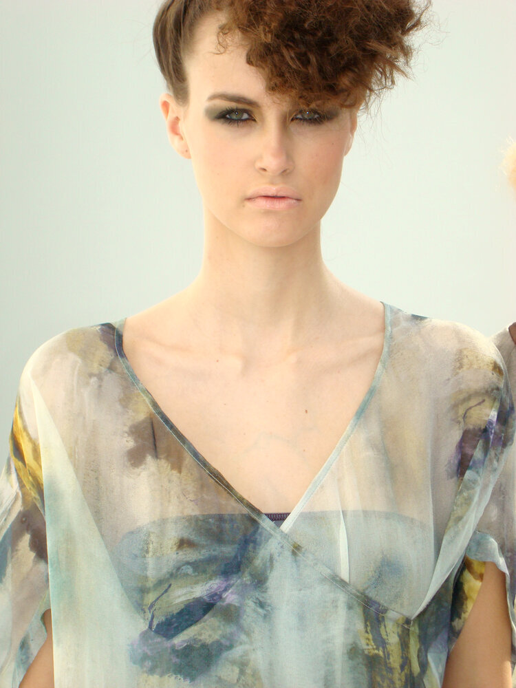
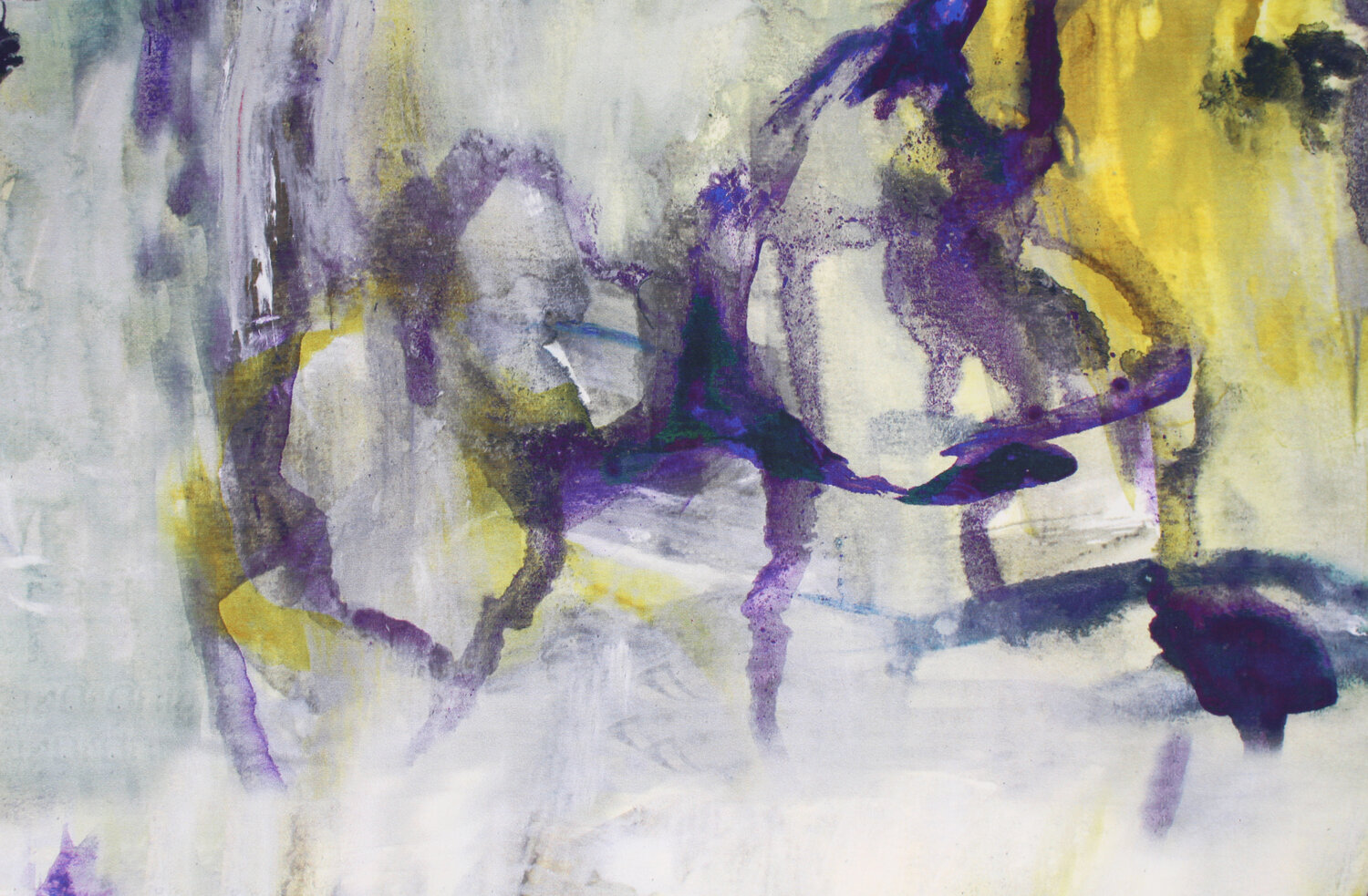
I met Ann Yee through a mutual friend who thought both of our creative needs might be met through collaboration. Ann was looking for an original print to use in her next collection, and I was looking to expand my art into different areas and potential uses. For this collection, Ann was drawn to caves, stalagmites, stalactites, and abstract textures. I took this as a cue to use multiple gray tones with subtle pops of color that could be found in nature.
ANN YEE (AUTUMN/WINTER 2013)
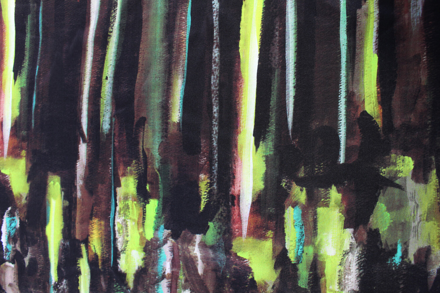
Ann and I collaborated again for her Autumn/Winter 2013 collection. It was based in dark foundations like navy, black, charcoal and ivory and mixed with a rich saturation of other fall colors like teal, burgundy, acorn, with unexpected pops of neon. Ann was inspired by the natural Appalachian landscape through the lens of the Abstract Expressionist art movement. She explored the interplay between art and nature as a vital incubator for famous painters from the American avant garde. The collection features a custom digital print on silk done in the style of abstract expressionism taken from one of my paintings based on a dense, lush forest.
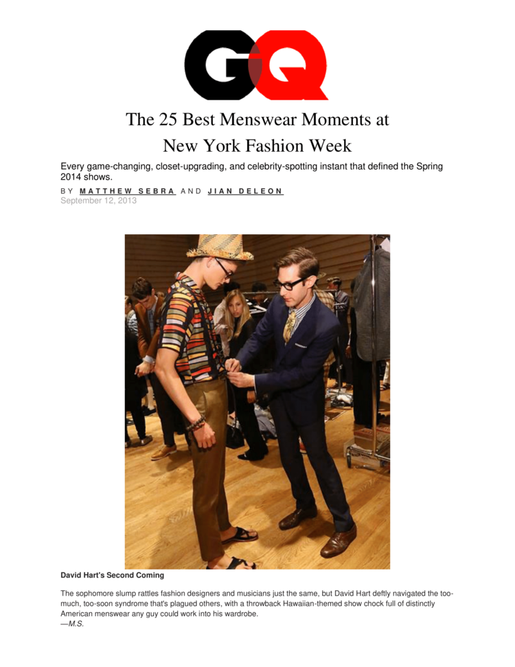
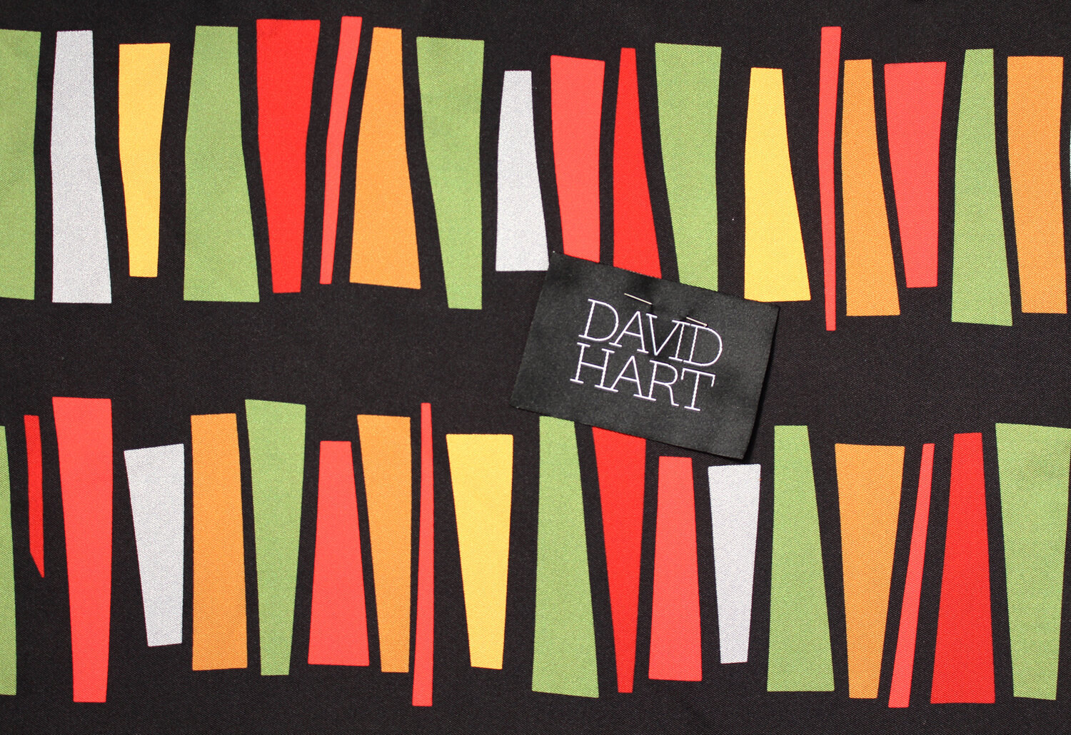
DAVID HART (SPRING/SUMMER 2014)
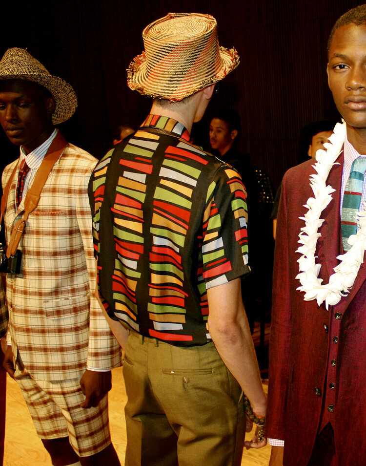
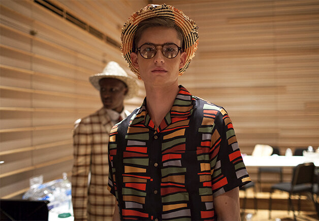
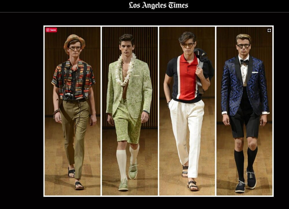
After creating two prints for other fashion collections, I was introduced to David as he needed a set of prints to include for his upcoming Spring collection. I was delighted to now be working with a menswear designer as a way to express my own versatility as an artist. His vision for a suite of prints was inspired by the Hawaiian and retro designs of the1950s and 60s. I used mesmerizing curvilinear geometric shapes, generalized fish shapes, tropical plants and leaves, and colors one might see during the midcentury-modern era: avocado green, salmon pink, tangerine orange, or mustard. The end result was a fresh take on that idea in a large “stripe” composed of bold stacked and tumbling rectangles.